Skewed data prevail in real life. Unless you observe trivial or near constant processes data is skewed one way or another due to outliers, long tails, errors or something else. Such effects create problems in visualizations when a few data elements are much larger than the rest.
Consider U.S. 2016 merchandise trade partner balances data set where each point is a country with 2 features: U.S. imports and exports against it:
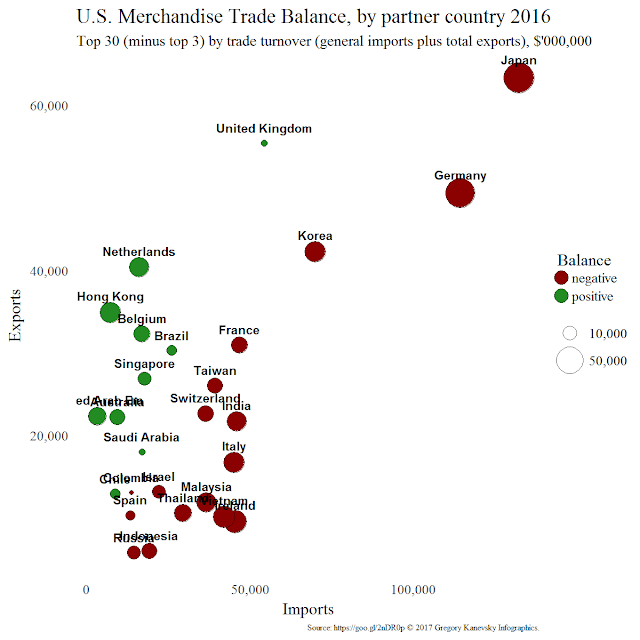
Suppose we decided to visualize top 30 U.S trading partners using bubble chart, which simply is a 2D scatter plot with the third dimension expressed through point size. Then U.S. trade partners become disks with imports and exports for xy coordinates and trade balance (abs(export - import)) for size:

China, Canada, and Mexico run far larger balances compared to the other 27 countries which causes most data points to collapse into crowded lower left corner. One way to "solve" this problem is to eliminate 3 mentioned outliers from the picture:

While this plot does look better it no longer serves its original purpose of displaying all top trading partners. And undesirable effect of outliers though reduced still presents itself with new ones: Japan, Germany, and U.K. So let us bring all countries back into the mix by trying logarithmic scale.
Quick refresher from algebra. Log function (in this example log base 10 but the same applies to natural log or log base 2) is commonly used to transform positive real numbers. All because of its property of mapping multiplicative relationships into additive ones. Indeed, given numbers A, B, and C such that
applying log results in additive relationship:
For example, let A=100, B=1000, and C=100000 then
`log(100) + log(1000) = log(100000)` or `2 + 3 = 5`
Observe this on 1D plane:


Logarithmic scale is simply a log transformation applied to all feature's values before plotting them. In our example we used it on both trading partners' features - imports and exports which gives bubble chart new look:

`A*B=C and A,B,C > 0`
applying log results in additive relationship:
`log(A) + log(B) = log(C)`
For example, let A=100, B=1000, and C=100000 then
`100 * 1000 = 100000`
so that after transformation it becomes
`log(100) + log(1000) = log(100000)` or `2 + 3 = 5`
Observe this on 1D plane:

The same data displayed on logarithmic scale appear almost uniform but not to forget the farther away points from 0 the more orders of magnitude they are apart on actual scale (observe this by scrolling back to the original plot). The main advantage of using log scale in this plot is ability of observing relationships between all top 30 countries without loosing the whole picture and avoiding collapsing smaller points together.
For more detailed discussion of logarithmic scale refer to When Should I Use Logarithmic Scales in My Charts and Graphs? Oh, and how about that trade deficit with China?
This is a re-post from the original blog on LinkedIn.