JavaScript Loaders

Monday, September 4, 2017

How Pets Get Admitted and Later Leave Dallas Animal Shelters

Thanks to Dallas OpenData anyone has access to the city animal shelter records.  If you lost or found a pet it could be that he or she spent some time in a shelter - I personally took lost dogs there. It's unfortunate but every year tens of thousands of animals find their way to shelters with significant fraction never finding way out. 


What and How Many Animals are Admitted?


City of Dallas animal shelter dataset contains 5 different animal types with solid lead belonging to dogs and cats (hardly any surprise to anyone):


For consistency and plausibility of analysis we will focus on cats and dogs only


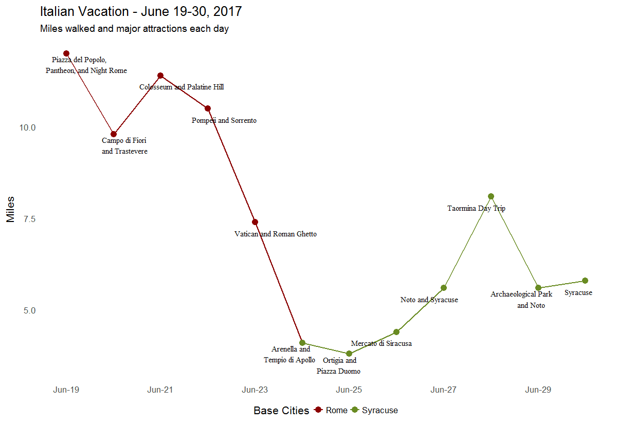
How Animals get Admitted


Each shelter record has animal's intake type (reason animal was admitted) and outcome (cause for animal disharge). Top 2 reasons why cats and dogs turn up at shelters are Stray (lost or abandoned) and Owner Surrender (willingly brought in by owner) while Confiscated (abused, no owner, etc.) is #3 for dogs but not cats


How Animals Leave Shelter


Animals leave shelters (either alive or dead) for 4 main reasons (outcomes):  Adoption (good),  Euthanized (bad), Returned to Owner (good), and Transfer (neutral):


Unfortunately, for both cats and dogs the top reason to leave shelter is being euthanized. But that's where similarity between them ends: 


  • cats don't get returned to owner anywhere near as often as dogs;
  • dogs' adoption and euthanized rates are almost the same while cats get adopted far less. 

From Admissions to Outcomes with Sankey


So what is the relationship between intake types and outcomes? Which and to what extent intake types drive outcomes? The good news there is some causality effect because each stay begins with intake type and ends with outcome. 

We begin analyzing this relationship with higher level (in that case) but visually appealing visualization called sankey diagram (or just sankey). It is a specific type of flow diagram, in which the width of the arrows is shown proportionally to the flow quantity. In our case each dog shelter stay contributes to the pipe size flowing from left (an intake type) to right (an outcome). With this we basically visualize conditional probabilities of dog leaving shelter with certain outcome given its admission intake type (first image illustrates transitions for cats and second does the same for dogs):


While Owner Surrender intake type flows similarly for both, Stray animals don't: cat outcomes are dominated by Euthanized but dogs are dominated by Adoption with Transfer and Returned to Owner outcomes together matching Euthanized.


Correlations Between Admissions and Outcomes


Next, we go beyond overall totals used in the sankey and compute correlations. To correlate intake types and outcomes we construct time series by computing monthly totals for each intake type and outcome obtaining monthly trends. Then we correlate between monthly trends (separate for cats and dogs) animals brought in and removed from Dallas animal shelters for each pair of top intake types (Confiscated, Owner Surrender, and Stray) and outcomes (Adoption, Euthanized, Returned to Owner, and Transfer) - 12 coefficients in total:


In this case strong correlation implies (at least to some extent) causation effect due to presence of temporal relationship, consistency, and plausibility criteria (see here and here). Few observations to note:
  • The highest correlation for cats (0.91) and second highest for dogs (0.77) are observed between intake Surrendered by Owner and outcomeEuthanized which is almost as obvious as unfortunate.
  • Correlation between Stray and Returned to Owner for dogs is the highest at 0.86. This is great news because it means the more dogs get lost the more of them are found. The higher this correlation the healthier the city for 2 reasons: a) lost animals return home and b) larger share of stray dogs are lost ones and not abandoned (given that the city keeps collecting them).
  • Unfortunately trend in Stray cats correlates highly with Euthanized. So while Stray dog trend drives adoptions and returns, Stray cat trend affects euthanizations the most (we've seen that in sankey as well).
  • No trends are affected by variations in Confiscated dogs, but this is likely due to smaller share of such admissions.
  • Variation in Stray dogs admitted affect every outcome (but Euthanized). Indeed Stray intake type is the largest and is almost twice as big as the 2d largest dog type Owner Surrender
  • Low correlation for dogs between Stray and Euthanized needs additional analysis because it's counter-intuitive.

Monthly Trends


But can we do better than correlations of these trends which technically are sophisticated but still aggregates? Next visual places time series instead of correlation coefficients inside the same matrix grid allowing to see and compare actual monthly trends:


Note that each plot is a 3 x 4 matrix - the same dimension as correlations matrices before. But instead of correlation coefficient each cell contains a pair of monthly trends (in fact, each correlation was computed for these exact pairs of trends, hence, a reference to its aggregation origin). Each row corresponds to an intake type (the same blue line in each) and each column to an outcome (the same red line in each). Being able to see trends over time let's record a few observations (following the matrix order top down):
  • Confiscated intake trends flat for both cats and dogs with only significant spike for dogs in January 2016. This spike is so unusual, relatively big, and contained within single month or two that it begs additional investigation into probable external event or procedural change that may have caused it.
  • Number of Confiscated animals is relatively low to noticeably affect outcomes. Still, if we can reduce effect of other intake types some relationships are possible.
  • Owner Surrender trend correlation with Euthanized outcome is so obvious that this type of visualization is sufficient to find it. Yes, it is unfortunate but people bring their old or unhealthy pets for a reason. 
  • The same applies to Stray and Owner Surrender for cats only. 
  • Owner Surrender has significant seasonal component spiking in summer possibly due to hot weather or holiday season or both. For cats only seasonal component is also strong in Stray trend.
  • Euthanized trends together with Owner Surrender which causes it to a large degree.
  • Stray dogs trend slowly upwards in Dallas and it's alarming.
  • Adoption also trends upwards but not steep enough to compensate for inflow of dogs into shelters.  Targeted campaign to encourage more adoptions of pets in the city is due.
  • Transfer outcome trending upward also compensates  for the growth in stray dogs. It's not clear if it's positive or negative though as there is no means to track what happens to dogs after transfer (or is it?).
  • Stray trend for dogs dipped in January 2016 exactly when confiscated trend spiked - it could be a coincidence or related - for sure something to consider when investigating further.
  • For dogs Euthanized trend correlates strongly with Stray intake until the summer of 2016 when they start to diverge in opposite directions - again some policy or procedural change apparently caused it. Indeed, if we observe other outcomes we notice that Returned to Owner trend began its uptick at around the same time (indeed, after I observed this I found out about this and this - significant changes in Dallas Animal Services leadership and policies around summer and fall of 2016).
I will be back with more analysis (survival analysis). R code for data processing, analysis, and visualizations from this post can be found here.

Wednesday, July 5, 2017

The Role of Small Data and Vacation Recap Example

Wikipedia defines small data 'small' enough for human comprehension but then it goes further by qualifying data in a volume and format that makes it accessible, informative and actionable. I am not certain the latter is always true: smaller footprint doesn't automatically qualify data as informative and actionable without more work. In my book small data usually scales to kilobytes and has just a handful of dimensions. But its main feature remains human comprehension which really means there is simple story behind it. 

In the grand scheme of big data things small data story is the last mile of data science analysis. It still requires interpretation (or representation) in the form of visualization or application.


Case in point could be Google spreadsheet I kept while on vacation in Italy with daily recordings of miles and steps walked. Later I added main attractions for each day. The result was my personal small data covering about 2 weeks of touring Italy with bases in Rome and later in Sicily (this sentence was the story):

Google sheet of activities while on vacation in Italy

As-is this spreadsheet is destined to Google archives contributing to ever growing collection of docs I created and happily forgot about. So I created this visualization that represents both most of data and the story:


Small data visualization

Before explaining how this visualization was created with R I ought to acknowledge that Google spreadsheets offer adding a chart or graph to a document. But its functionality appears rather limited without resorting to JavaScript API.

Using R googlesheets package to source Google docs makes them integral part of data sources available from within R code:
For details on how code above authenticates with Google servers and processes documents see very detailed vignettes

Now we can get back to small data and its simple story. Which means single visualization may include most if not all of it. In case of small data the goal is designing such chart without sacrificing clarity.

Core attributes days (Date) and miles walked (Distance; I chose miles over Steps for simplicity) suggest a line chart with timeline along x-axis and distance for y-axis. But there are 2 more factors to incorporate: Place indicating where the base city was each day and Label for major attractions.


Base city receives color identification with deep red for Rome and olive green for Syracuse. Major attractions text was attached to each point with smart justifications to fit inside the chart:


Had I kept more detailed log I would have ended up with more dimensions to use. For example, miles driven by car or train, time spent at leisure versus touring, number of cities and places visited, historical marker attributes and so on. But that moves us further away from small data domain as footprint and dimensions grow and story becomes less comprehensible. One of indicators of this is that it becomes harder to collect data manually. Instead, there are apps that would do it for me, for example, Life Cycle or Apple Health.

Ultimately any big data problem is reduced to one or more small data ones by aggregating, regressions, clustering or some other data science method. The path to big data insights is a journey from big to small data in search of simple story. So learning how to deal with small data is where it all both ends and begins.

Friday, June 23, 2017

Logarithmic Scale Explained with U.S. Trade Balance

Skewed data prevail in real life. Unless you observe trivial or near constant processes data is skewed one way or another due to outliers, long tails, errors or something else. Such effects create problems in visualizations when a few data elements are much larger than the rest.
Consider U.S. 2016 merchandise trade partner balances data set where each point is a country with 2 features: U.S. imports and exports against it:
Suppose we decided to visualize top 30 U.S trading partners using bubble chart, which simply is a 2D scatter plot with the third dimension expressed through point size. Then U.S. trade partners become disks with imports and exports for xy coordinates and trade balance (abs(export - import)) for size:
China, Canada, and Mexico run far larger balances compared to the other 27 countries which causes most data points to collapse into crowded lower left corner. One way to "solve" this problem is to eliminate 3 mentioned outliers from the picture:

 While this plot does look better it no longer serves its original purpose of displaying all top trading partners. And undesirable effect of outliers though reduced still presents itself with new ones: Japan, Germany, and U.K. So let us bring all countries back into the mix by trying logarithmic scale.
Quick refresher from algebra. Log function (in this example log base 10 but the same applies to natural log or log base 2) is commonly used to transform positive real numbers. All because of its property of mapping multiplicative relationships into additive ones. Indeed, given numbers A, B, and C such that

`A*B=C and A,B,C > 0`

applying log  results in additive relationship:

`log(A) + log(B) = log(C)`

For example, let A=100, B=1000, and C=100000 then
 
`100 * 1000 = 100000`

so that after transformation it becomes

`log(100) + log(1000) = log(100000)`  or   `2 + 3 = 5`

Observe this on 1D plane:


Logarithmic scale is simply a log transformation applied to all feature's values before plotting them. In our example we used it on both trading partners' features - imports and exports which gives bubble chart new look:

 
The same data displayed on logarithmic scale appear almost uniform but not to forget the farther away points from 0 the more orders of magnitude they are apart on actual scale (observe this by scrolling back to the original plot). The main advantage of using log scale in this plot is ability of observing relationships between all top 30 countries without loosing the whole picture and avoiding collapsing smaller points together.
For more detailed discussion of logarithmic scale refer to When Should I Use Logarithmic Scales in My Charts and Graphs? Oh, and how about that trade deficit with China?
This is a re-post from the original blog on LinkedIn.

Friday, May 26, 2017

MapReduce in Two Modern Paintings

Two years ago we had a rare family outing at the Dallas Museum of Art (my son is a teenager and he's into sport after all). DMA hosted an excellent exhibition of modern art and allowed taking pictures. Two hours and dozen of pictures later my weekend was over but thanks to Google Photos I stumbled upon those pictures again. Suddenly, I realized that two paintings captured make up an illustration of one of the most important framework in big data - MapReduce.

There are multiple papers, tutorials and web pages about it and to truly understand and use framework like this one should study at least a few thoroughly. There are also illustrations of MapReduce architecture and principles out there too.

But the power of art can express more with less and with just two paintings below I will try to illustrate this for MapReduce.  

First, we have the work by ErrĂ³ Foodscape, 1964:


It illustrates variety, richness, potential of insight (if consumed properly), and of course, scale. The painting is boundless with no ends to the table surface in all 4 directions. Observe many types of food and drinks, packaging, presentations, varying in colors, texture and origin (better quality image found here). Thus the painting represents big data so much better than any flowchart or diagram.

The 2d and final painting is by Wayne Thiebaud Salads, Sandwiches, and Desserts, 1962:


Should we think of how MapReduce works this seemingly infinite table fittingly resembling conveyor belt looks like a result of split-apply-combine on food items from Foodscape universe. Indeed, each vertical group is a combination of the same type of finished and plated food combined into variably sized groups and ready to serve (better quality image found here). One can imagine an invisible hand of MapReduce process grouping and arranging items as they flow over conveyor belt.

As with any art there is much about MapReduce that was left out of the picture. That's why we still have papers, books, and Wikipedia.  And again, I'd like to remind of importance of taking your kids to a museum.